Grain
Deliverables
Year
Showcase your stunning projects and captivate your audience with ProFile X
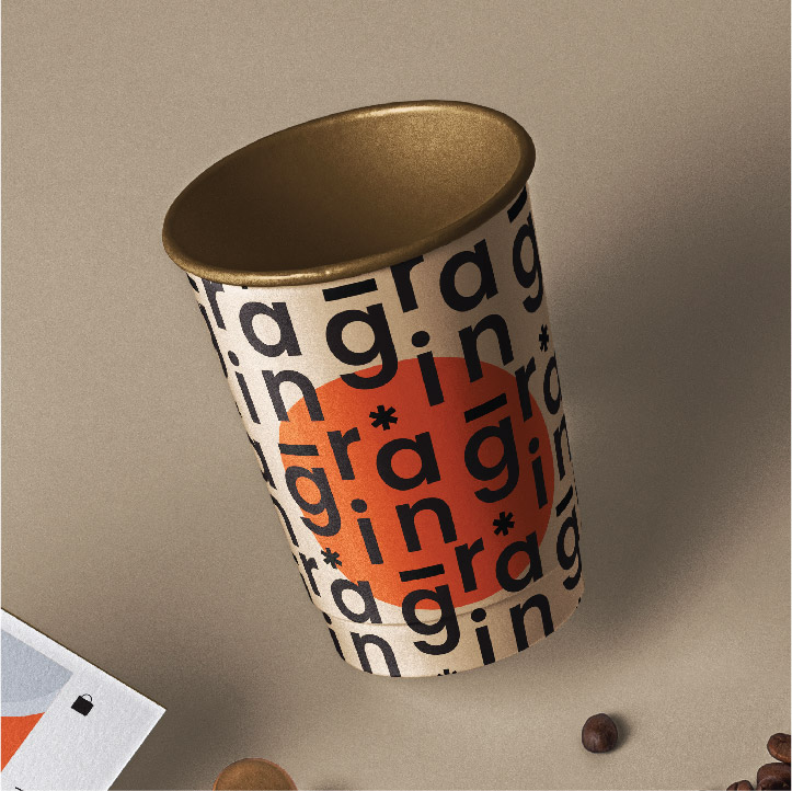
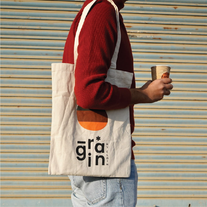
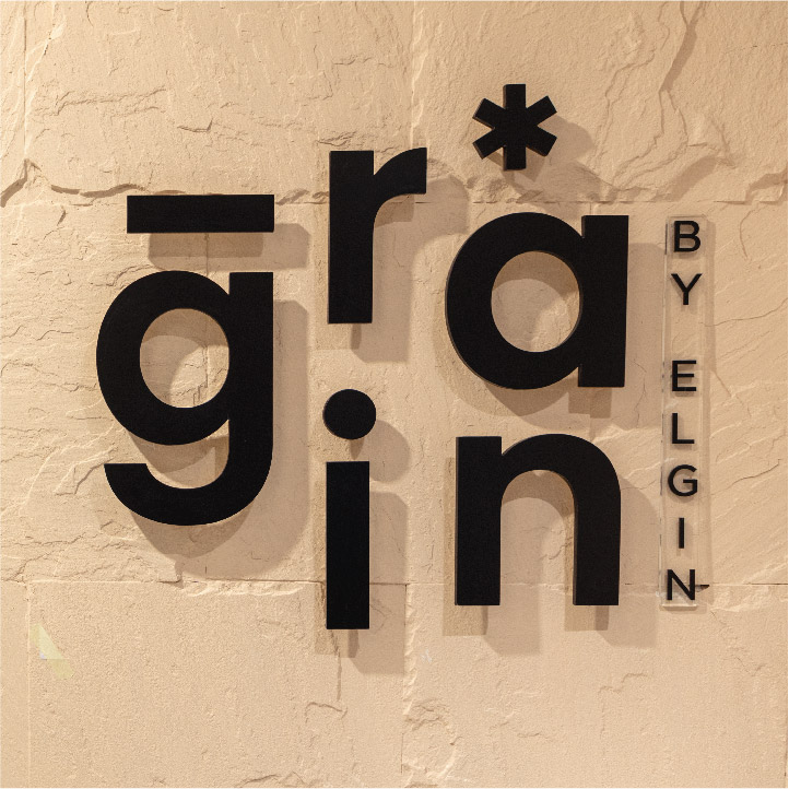
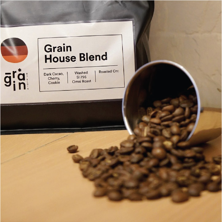
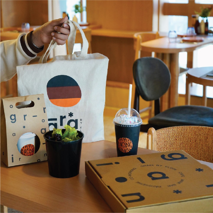
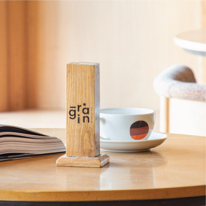
Thoughtfully designed and curated, Grain is a coffeeshop that seamlessly goes from day to night. With light colours and airy spaces, it brings together comfort with sophisticated design. For the visual identity we chose a pop of orange, since the space was mostly neutral and clean. This helped us add a youthful vibrance to the space via the menus, coasters, packaging and other print collateral. Keeping in line with the architecture, the logo is a simple and clean type deconstructed to create a circular form. The slightly wonky circle is the brand mark, representing colours of wood, coffee and the iconic orange. Bringing the identity together with the architecture of the space is always a great process and helps us build a very strong concept for the brand.
Portfolio
Showcase